


RE: GOD's USERBAR [WIP] 02-28-2016, 08:58 PM
#11


| GOD's USERBAR [WIP] filter_list | |
![[+]](https://sinister.li/images/modern/collapse_collapsed.png)



RE: GOD's USERBAR [WIP] 02-28-2016, 09:02 PM
#12
It doesn't look bad however looks a bit dated.
#LeSquad #Satellite

RE: GOD's USERBAR [WIP] 02-28-2016, 09:21 PM
#13
(02-28-2016, 09:02 PM)Para Wrote: It doesn't look bad however looks a bit dated.
Is there something I could do to make it better?
(02-28-2016, 08:58 PM)Sirius Wrote:(02-28-2016, 08:55 PM)Toucan Wrote: Pixelated Urban look?
No. Anything without a pixelated look/style.
I am not sure if I completely understand. Do you have an example?


RE: GOD's USERBAR [WIP] 02-29-2016, 10:40 PM
#14
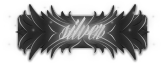
Maybe add more of those golden thingies to the sides of the user-bar (Or even add wings), and add outer glow to the word "God".
Nevertheless, it looks pretty professional & nice. Would suggest changing the text on the user-bar to another name or just add an "S" to make it "GODS".
I think he means where each 4x4 (square) pixels have the same color, or in other words, they look like 1 pixel. Just the same as growing up pixels.
Welp.
Nevertheless, it looks pretty professional & nice. Would suggest changing the text on the user-bar to another name or just add an "S" to make it "GODS".
(02-28-2016, 09:21 PM)Toucan Wrote:(02-28-2016, 08:58 PM)Sirius Wrote: No. Anything without a pixelated look/style.
I am not sure if I completely understand. Do you have an example?
I think he means where each 4x4 (square) pixels have the same color, or in other words, they look like 1 pixel. Just the same as growing up pixels.
Welp.
![[Image: opligitorygmailcom.gif]](http://sig.grumpybumpers.com/host/opligitorygmailcom.gif)


![[Image: queenaly.gif]](http://sig.grumpybumpers.com/host/queenaly.gif)

RE: GOD's USERBAR [WIP] 03-08-2016, 02:15 PM
#17
Oh it's you! I haven't seen you much lately :o
Good work on the userbar, it's great! Only thing I can suggest is to try fill the black with some slight, very slight, decoration inside to take away a little of the plainness.
Make sure to back up though, it may look worse instead, you'll never know untill you try. Other than that, it's not really anything esle I can imagine could be better.
Good work on the userbar, it's great! Only thing I can suggest is to try fill the black with some slight, very slight, decoration inside to take away a little of the plainness.
Make sure to back up though, it may look worse instead, you'll never know untill you try. Other than that, it's not really anything esle I can imagine could be better.
![[Image: DiverseGraphics_Banner_wide.png]](https://i.thevirt.us/05/DiverseGraphics_Banner_wide.png)

![[Image: CMfs1Iz.gif]](https://i.imgur.com/CMfs1Iz.gif)
